

Analysing FIT data with Perl: producing PNG plots
Last time, we worked out how to extract, collate, and print statistics about the data contained in a FIT file. Now we’re going to take the next logical step and plot the time series data.
Start plotting with Gnu
Now that we’ve extracted data from the FIT file, what else can we do with
it? Since this is time series data, the most natural next step is to
visualise the data values over time. Since I know that
Gnuplot handles time series data
well,1 I chose to use
Chart::Gnuplot to plot the
data.
An additional point in Gnuplot’s favour is that it can plot two datasets on the same graph, each with its own y-axis. Such functionality is handy when searching for correlations between datasets of different y-axis scales and ranges that share the same baseline data series.
Clearly Chart::Gnuplot relies on Gnuplot, so we need to install it first:
$ sudo apt install -y gnuplot
Now we can install Chart::Gnuplot with cpanm:
$ cpanm Chart::Gnuplot
Putting our finger on the pulse
Something I like looking at is how my heart rate evolved throughout a ride; it gives me an idea of how much effort I was putting in. So, we’ll start off by looking at how the heart rate data varied over time. In other words, we want time on the x-axis and heart rate on the y-axis.
One great thing about Gnuplot is that if you give it a format string for the time data, then plotting “just works”. In other words, explicit conversion to datetime data for the x-axis is unnecessary.
Here’s a script to extract the FIT data from our example data file. It
displays some statistics about the activity and plots heart rate versus
time. I’ve given the script the filename geo-fit-plot-data.pl:
  1use strict;
  2use warnings;
  3
  4use Geo::FIT;
  5use Scalar::Util qw(reftype);
  6use List::Util qw(max sum);
  7use Chart::Gnuplot;
  8
  9
 10sub main {
 11    my @activity_data = extract_activity_data();
 12
 13    show_activity_statistics(@activity_data);
 14    plot_activity_data(@activity_data);
 15}
 16
 17sub extract_activity_data {
 18    my $fit = Geo::FIT->new();
 19    $fit->file( "2025-05-08-07-58-33.fit" );
 20    $fit->open or die $fit->error;
 21
 22    my $record_callback = sub {
 23        my ($self, $descriptor, $values) = @_;
 24        my @all_field_names = $self->fields_list($descriptor);
 25
 26        my %event_data;
 27        for my $field_name (@all_field_names) {
 28            my $field_value = $self->field_value($field_name, $descriptor, $values);
 29            if ($field_value =~ /[a-zA-Z]/) {
 30                $event_data{$field_name} = $field_value;
 31            }
 32        }
 33
 34        return \%event_data;
 35    };
 36
 37    $fit->data_message_callback_by_name('record', $record_callback ) or die $fit->error;
 38
 39    my @header_things = $fit->fetch_header;
 40
 41    my $event_data;
 42    my @activity_data;
 43    do {
 44        $event_data = $fit->fetch;
 45        my $reftype = reftype $event_data;
 46        if (defined $reftype && $reftype eq 'HASH' && defined %$event_data{'timestamp'}) {
 47            push @activity_data, $event_data;
 48        }
 49    } while ( $event_data );
 50
 51    $fit->close;
 52
 53    return @activity_data;
 54}
 55
 56# extract and return the numerical parts of an array of FIT data values
 57sub num_parts {
 58    my $field_name = shift;
 59    my @activity_data = @_;
 60
 61    return map { (split ' ', $_->{$field_name})[0] } @activity_data;
 62}
 63
 64# return the average of an array of numbers
 65sub avg {
 66    my @array = @_;
 67
 68    return (sum @array) / (scalar @array);
 69}
 70
 71sub show_activity_statistics {
 72    my @activity_data = @_;
 73
 74    print "Found ", scalar @activity_data, " entries in FIT file\n";
 75    my $available_fields = join ", ", sort keys %{$activity_data[0]};
 76    print "Available fields: $available_fields\n";
 77
 78    my $total_distance_m = (split ' ', ${$activity_data[-1]}{'distance'})[0];
 79    my $total_distance = $total_distance_m/1000;
 80    print "Total distance: $total_distance km\n";
 81
 82    my @speeds = num_parts('speed', @activity_data);
 83    my $maximum_speed = max @speeds;
 84    my $maximum_speed_km = $maximum_speed*3.6;
 85    print "Maximum speed: $maximum_speed m/s = $maximum_speed_km km/h\n";
 86
 87    my $average_speed = avg(@speeds);
 88    my $average_speed_km = sprintf("%0.2f", $average_speed*3.6);
 89    $average_speed = sprintf("%0.2f", $average_speed);
 90    print "Average speed: $average_speed m/s = $average_speed_km km/h\n";
 91
 92    my @powers = num_parts('power', @activity_data);
 93    my $maximum_power = max @powers;
 94    print "Maximum power: $maximum_power W\n";
 95
 96    my $average_power = avg(@powers);
 97    $average_power = sprintf("%0.2f", $average_power);
 98    print "Average power: $average_power W\n";
 99
100    my @heart_rates = num_parts('heart_rate', @activity_data);
101    my $maximum_heart_rate = max @heart_rates;
102    print "Maximum heart rate: $maximum_heart_rate bpm\n";
103
104    my $average_heart_rate = avg(@heart_rates);
105    $average_heart_rate = sprintf("%0.2f", $average_heart_rate);
106    print "Average heart rate: $average_heart_rate bpm\n";
107}
108
109sub plot_activity_data {
110    my @activity_data = @_;
111
112    my @heart_rates = num_parts('heart_rate', @activity_data);
113    my @times = map { $_->{'timestamp'} } @activity_data;
114
115    my $date = "2025-05-08";
116
117    my $chart = Chart::Gnuplot->new(
118        output => "watopia-figure-8-heart-rate.png",
119        title  => "Figure 8 in Watopia on $date: heart rate over time",
120        xlabel => "Time",
121        ylabel => "Heart rate (bpm)",
122        terminal => "png size 1024, 768",
123        timeaxis => "x",
124        xtics => {
125            labelfmt => '%H:%M',
126        },
127    );
128
129    my $data_set = Chart::Gnuplot::DataSet->new(
130        xdata => \@times,
131        ydata => \@heart_rates,
132        timefmt => "%Y-%m-%dT%H:%M:%SZ",
133        style => "lines",
134    );
135
136    $chart->plot2d($data_set);
137}
138
139main();
A lot has happened between this code and the previous scripts. Let’s review it to see what’s changed.
The biggest changes were structural. I’ve moved the code into separate routines, improving encapsulation and making each more focused on one task.
The FIT file data extraction code I’ve put into its own routine
(extract_activity_data(); lines 17-54). This sub returns the array of
event data that we’ve been
using.
I’ve also created two utility routines num_parts() (lines 57-62) and
avg() (lines 65-69). These return the numerical parts of the activity
data and average data series value, respectively.
The ride statistics calculation and display code is now located in the
show_activity_statistics() routine. Now it’s out of the way, allowing us
to concentrate on other things.
The plotting code is new and sits in a sub called plot_activity_data()
(lines 109-137). We’ll focus much more on that later.
These routines are called from a main() routine (lines 10-15) giving us a
nice bird’s eye view of what the script is trying to achieve. Running all
the code is now as simple as calling main() (line 139).
Particulars of pulse plotting
Let’s zoom in on the plotting code in plot_activity_data(). After having
imported Chart::Gnuplot at the top of the file (line 7), we need to do a
bit of organising before we can set up the chart. We extract the activity
data with extract_activity_data() (line 11) and pass this as an argument
to plot_activity_data() (line 14). At the top of plot_activity_data()
we fetch an array of the numerical heart rate data (line 112) and an array
of all the timestamps (line 113).
The activity’s date (line 115) is assigned as a string variable because I want this to appear in the chart’s title. Although the date is present in the activity data, I’ve chosen not to calculate its value until later. This way we get the plotting code up and running sooner, as there’s still a lot to discuss.
Now we’re ready to set up the chart, which takes place on lines 117-127.
We create a new Chart::Gnuplot object on line 117 and configure the plot
with various keyword arguments to the object’s constructor.
The parameters are as follows:
outputspecifies the name of the output file as a string. The name I’ve chosen reflects the activity as well as the data being plotted.titleis a string to use as the plot’s title. To provide context, I mention the name of the route (Figure 8) within Zwift’s main virtual world (Watopia) as well as the date of the activity. To highlight that we’re plotting heart rate over time, I’ve mentioned this in the title also.xlabelis a string describing the x-axis data.ylabelis a string describing the y-axis data.- the
terminaloption tells Gnuplot to use the PNG2 “terminal”3 and to set its dimensions to 1024x768. timeaxistells Gnuplot which axis contains time-based data (in this case the x-axis). This enables Gnuplot to space out the data along the axis evenly. Often, the spacing between points in time-based data isn’t regular; for instance, data points can be missing. Hence, naively plotting unevenly-spaced time data can produce a distorted graph. Telling Gnuplot that the x-axis contains time-based data allows it to add appropriate space where necessary.xticsis a hash of options to configure the behaviour of the ticks on the x-axis. The setting here displays hour and minute information at each tick mark for our time data. We omit the year, month and day information as this is the same for all data points.
Now that the main chart parameters have been set, we can focus on the data
we want to plot. In Chart::Gnuplot parlance, a Chart::Gnuplot::DataSet
object represents a set of data to plot. Lines 129-134 instantiate such an
object which we later pass to the Chart::Gnuplot object when plotting the
data (line 136). One configures Chart::Gnuplot::DataSet objects similarly
to how Chart::Gnuplot objects are constructed: by passing various options
to its constructor. These options include the data to plot and how this
data should be styled on the graph.
The options used here have the following meanings:
xdatais an array reference to the data to use for the x-axis. If this option is omitted, then Gnuplot uses the array indices of the y-data as the x-axis values.ydatais an array reference to the data to use for the y-axis.timefmtspecifies the format string Gnuplot should use when reading the time data in thexdataarray. Timestamps are strings and we need to inform Gnuplot how to parse them into a form useful for x-axis data. Were the x-axis data a numerical data type, this option wouldn’t be necessary.styleis a string specifying the style to use for plotting the data. In this example, we’re plotting the data points as a set of connected lines. Check out theChart::Gnuplotdocumentation for a full list of the available style options.
We finally get to plot the data on line 136. The data set gets passed to
the Chart::Gnuplot object as the argument to its plot2d() method. As
its name suggests, this plots 2D data, i.e. y versus x. Gnuplot can also
display 3D data, in which case we’d call plot3d(). When plotting 3D data
we’d have to include a z dimension when setting up the data set.
Running this code
$ perl geo-fit-plot-data.pl
generates this plot:
A couple of things are apparent when looking at this graph. It took me a while to get going (my pulse rose steadily over the first ~15 minutes of the ride) and the time is weird (6 am? Me? Lol, no). We’ll try to explain the heart rate behaviour later.
But first, what’s up with the time data? Did I really start riding at 6 o’clock in the morning? I’m not a morning person, so that’s not right. Also, I’m pretty sure my neighbours wouldn’t appreciate me coughing and wheezing at 6 am while trying to punish myself on Zwift. So what’s going on?
For those following carefully, you might have noticed the trailing Z on
the timestamp data. This means that the time zone is UTC. Given that this
data is from May and I live in Germany, this implies that the local time
would have been 8 am. Still rather early for me, but not too early to
disturb the neighbours too much.4 In other
words, we need to fix the time zone to get the time data right.
Getting into the zone
How do we fix the time zone? I’m glad you asked! We need to parse the
timestamp into a DateTime object, set the time zone, and then pass the
fixed time data to Gnuplot. It turns out that the standard DateTime
library doesn’t parse date/time strings.
Instead, we need to use
DateTime::Format::Strptime.
This module parses date/time strings much like the strptime(3) POSIX
function
does and returns DateTime objects.
Since the module isn’t part of the core Perl distribution, we need to install it:
$ cpanm DateTime::Format::Strptime
Most of the code changes that follow take place only within the plotting
routine (plot_activity_data()). So, I’m going to focus on that from now
on and won’t create a new script for the new version of the code.
The first thing to do is to import the DateTime::Format::Strptime module:
 use Scalar::Util qw(reftype);
 use List::Util qw(max sum);
 use Chart::Gnuplot;
+use DateTime::Format::Strptime;
Extending plot_activity_data() to set the correct time zone, we get this
code:
 1sub plot_activity_data {
 2    my @activity_data = @_;
 3
 4    # extract data to plot from full activity data
 5    my @heart_rates = num_parts('heart_rate', @activity_data);
 6    my @timestamps = map { $_->{'timestamp'} } @activity_data;
 7
 8    # fix time zone in time data
 9    my $date_parser = DateTime::Format::Strptime->new(
10        pattern => "%Y-%m-%dT%H:%M:%SZ",
11        time_zone => 'UTC',
12    );
13
14    my @times = map {
15        my $dt = $date_parser->parse_datetime($_);
16        $dt->set_time_zone('Europe/Berlin');
17        my $time_string = $dt->strftime("%H:%M:%S");
18        $time_string;
19    } @timestamps;
20
21    # determine date from timestamp data
22    my $dt = $date_parser->parse_datetime($timestamps[0]);
23    my $date = $dt->strftime("%Y-%m-%d");
24
25    # plot data
26    my $chart = Chart::Gnuplot->new(
27        output => "watopia-figure-8-heart-rate.png",
28        title  => "Figure 8 in Watopia on $date: heart rate over time",
29        xlabel => "Time",
30        ylabel => "Heart rate (bpm)",
31        terminal => "png size 1024, 768",
32        timeaxis => "x",
33        xtics => {
34            labelfmt => '%H:%M',
35        },
36    );
37
38    my $data_set = Chart::Gnuplot::DataSet->new(
39        xdata => \@times,
40        ydata => \@heart_rates,
41        timefmt => "%H:%M:%S",
42        style => "lines",
43    );
44
45    $chart->plot2d($data_set);
46}
The timestamp data is no longer read straight into the @times array; it’s
stored in the @timestamps temporary array (line 6). This change also
makes the variable naming a bit more consistent, which is nice.
To parse a timestamp string into a DateTime object, we need to tell
DateTime::Format::Strptime how to format the timestamp (lines 8-12). This
is the purpose of the pattern argument in the DateTime::Format::Strptime
constructor (line 10). You might have noticed that we used the same pattern
when telling Gnuplot what format the time data was in. We also specify the
time zone (line 11) to ensure that the date/time data is parsed as UTC.
Next, we fix the time zone in all elements of the @timestamps array (lines
14-19). I’ve chosen to do this within a map here. I could extract this
code into a well-named routine, but it does the job for now. The map
parses the date/time string into a Date::Time object (line 15) and sets
the time zone to Europe/Berlin5 (line 16). We only need to
plot the time data,6 hence we format the DateTime
object as a string including only hour, minute and second information (line
17). Even though we only use hours and minutes for the x-axis tick labels
later, the time data is resolved down to the second, hence we retain the
seconds information in the @times array.
One could write a more compact version of the time zone correction code like this:
my @times = map {
    $date_parser->parse_datetime($_)
        ->set_time_zone('Europe/Berlin')
        ->strftime("%H:%M:%S");
} @timestamps;
yet, in this case, I find giving each step a name (via a variable) helps the code explain itself. YMMV.
The next chunk of code (lines 22-23) isn’t related to the time zone fix. It
generalises working out the current date from the activity data. This way I
can use a FIT file from a different activity without having to update the
$date variable by hand. The process is simple: all elements of the
@timestamps array have the same date, so we choose to parse only the first
one (line 22)7. This gives us a DateTime object
which we convert into a formatted date string (via the strftime() method)
composed of the year, month and day (line 23). We don’t need to fix the
time zone because UTC is sufficient in this case to extract the date
information. Of course, if you’re in a time zone close to the international
date line you might need to set the time zone to get the correct date.
The last thing to change is the timefmt option to the
Chart::Gnuplot::DataSet object on line 41. Because we now only have hour,
minute and second information, we need to update the time format string to
reflect this.
Now we’re ready to run the script again! Doing so
$ perl geo-fit-plot-data.pl
creates this graph

where we see that the time information is correct. Yay! 🎉
How long can this go on?
Now that I look at the graph again, I realise something: it doesn’t matter
when the data was taken (at least, not for this use case). What matters
more is the elapsed time from the start of the activity until the end. It
looks like we need to munge the time
data again. The job now is to convert the timestamp information into
seconds elapsed since the ride began. Since we’ve parsed the timestamp data
into DateTime objects (in line 15 above), we can convert that value into
the number of seconds since the epoch (via the epoch()
method). As soon as we
know the epoch value for each element in the @timestamps array, we can
subtract the first element’s epoch value from each element in the array.
This will give us an array containing elapsed seconds since the beginning of
the activity. Elapsed seconds are a bit too fine-grained for an activity
extending over an hour, so we’ll also convert seconds to minutes.
Making these changes to the plot_activity_data() code, we get:
 1sub plot_activity_data {
 2    my @activity_data = @_;
 3
 4    # extract data to plot from full activity data
 5    my @heart_rates = num_parts('heart_rate', @activity_data);
 6    my @timestamps = map { $_->{'timestamp'} } @activity_data;
 7
 8    # parse timestamp data
 9    my $date_parser = DateTime::Format::Strptime->new(
10        pattern => "%Y-%m-%dT%H:%M:%SZ",
11        time_zone => 'UTC',
12    );
13
14    # get the epoch time for the first point in the time data
15    my $first_epoch_time = $date_parser->parse_datetime($timestamps[0])->epoch;
16
17    # convert timestamp data to elapsed minutes from start of activity
18    my @times = map {
19        my $dt = $date_parser->parse_datetime($_);
20        my $epoch_time = $dt->epoch;
21        my $elapsed_time = ($epoch_time - $first_epoch_time)/60;
22        $elapsed_time;
23    } @timestamps;
24
25    # determine date from timestamp data
26    my $dt = $date_parser->parse_datetime($timestamps[0]);
27    my $date = $dt->strftime("%Y-%m-%d");
28
29    # plot data
30    my $chart = Chart::Gnuplot->new(
31        output => "watopia-figure-8-heart-rate.png",
32        title  => "Figure 8 in Watopia on $date: heart rate over time",
33        xlabel => "Elapsed time (min)",
34        ylabel => "Heart rate (bpm)",
35        terminal => "png size 1024, 768",
36    );
37
38    my $data_set = Chart::Gnuplot::DataSet->new(
39        xdata => \@times,
40        ydata => \@heart_rates,
41        style => "lines",
42    );
43
44    $chart->plot2d($data_set);
45}
The main changes occur in lines 14-23. We parse the date/time information
from the first timestamp (line 15), chaining the epoch() method call to
find the number of seconds since the epoch. We store this result in a
variable for later use; it holds the epoch time at the beginning of the data
series. After parsing the timestamps into DateTime objects (line 19), we
find the epoch time for each time point (line 20). Line 21 calculates the
elapsed time from the time stored in $first_epoch_time and converts
seconds to minutes by dividing by 60. The map returns this value (line
22) and hence @times now contains a series of elapsed time values in
minutes.
It’s important to note here that we’re no longer plotting a date/time value
on the x-axis; the elapsed time is a purely numerical value. Thus, we
update the x-axis label string (line 33) to highlight this fact and remove
the timeaxis and xtics/labelfmt options from the Chart::Gnuplot
constructor. The timefmt option to the Chart::Gnuplot::DataSet
constructor is also no longer necessary and it too has been removed.
The script is now ready to go!
Running it
$ perl geo-fit-plot-data.pl
gives
That’s better!
Reaching for the sky
Our statistics output from earlier told us that the maximum heart rate was 165 bpm with an average of 142 bpm. Looking at the graph, an average of 142 bpm seems about right. It also looks like the maximum pulse value occurred at an elapsed time of just short of 50 minutes. We can check that guess more closely later.
What’s intriguing me now is what caused this pattern in the heart rate data.
What could have caused the values to go up and down like that? Is there a
correlation with other data fields? We know from earlier that there’s an
altitude field, so we can try plotting that along with the heart rate data
and see how (or if) they’re related.
Careful readers might have noticed something: how can you have a variation in altitude when you’re sitting on an indoor trainer? Well, Zwift simulates going up and downhill by changing the resistance in the smart trainer. The resistance is then correlated to a gradient and, given time and speed data, one can work out a virtual altitude gain or loss. Thus, for the data set we’re analysing here, altitude is a sensible parameter to consider. Even if you had no vertical motion whatsoever!
As I mentioned earlier, one of the things I like about Gnuplot is that one can plot two data sets with different y-axes on the same plot. Plotting heart rate and altitude on the same graph is one such use case.
To plot an extra data set on our graph, we need to set up another
Chart::Gnuplot::DataSet object, this time for the altitude data. Before
we can do that, we’ll have to extract the altitude data from the full
activity data set. Gnuplot also needs to know which data to plot on the
primary and secondary y-axes (i.e. on the left- and right-hand sides of the
graph). And we must remember to label our axes
properly. That’s a fair bit of work, so I’ve done
the hard
yakka for
ya. 😉
Here’s the updated plot_activity_data() code:
 1sub plot_activity_data {
 2    my @activity_data = @_;
 3
 4    # extract data to plot from full activity data
 5    my @heart_rates = num_parts('heart_rate', @activity_data);
 6    my @timestamps = map { $_->{'timestamp'} } @activity_data;
 7    my @altitudes = num_parts('altitude', @activity_data);
 8
 9    # parse timestamp data
10    my $date_parser = DateTime::Format::Strptime->new(
11        pattern => "%Y-%m-%dT%H:%M:%SZ",
12        time_zone => 'UTC',
13    );
14
15    # get the epoch time for the first point in the time data
16    my $first_epoch_time = $date_parser->parse_datetime($timestamps[0])->epoch;
17
18    # convert timestamp data to elapsed minutes from start of activity
19    my @times = map {
20        my $dt = $date_parser->parse_datetime($_);
21        my $epoch_time = $dt->epoch;
22        my $elapsed_time = ($epoch_time - $first_epoch_time)/60;
23        $elapsed_time;
24    } @timestamps;
25
26    # determine date from timestamp data
27    my $dt = $date_parser->parse_datetime($timestamps[0]);
28    my $date = $dt->strftime("%Y-%m-%d");
29
30    # plot data
31    my $chart = Chart::Gnuplot->new(
32        output => "watopia-figure-8-heart-rate-and-altitude.png",
33        title  => "Figure 8 in Watopia on $date: heart rate and altitude over time",
34        xlabel => "Elapsed time (min)",
35        ylabel => "Heart rate (bpm)",
36        terminal => "png size 1024, 768",
37        xtics => {
38            incr => 5,
39        },
40        y2label => 'Altitude (m)',
41        y2range => [-10, 70],
42        y2tics => {
43            incr => 10,
44        },
45    );
46
47    my $heart_rate_ds = Chart::Gnuplot::DataSet->new(
48        xdata => \@times,
49        ydata => \@heart_rates,
50        style => "lines",
51    );
52
53    my $altitude_ds = Chart::Gnuplot::DataSet->new(
54        xdata => \@times,
55        ydata => \@altitudes,
56        style => "boxes",
57        axes => "x1y2",
58    );
59
60    $chart->plot2d($altitude_ds, $heart_rate_ds);
61}
Line 7 extracts the altitude data from the full activity data. This code
also strips the unit information from the altitude data so that we only have
the numerical part, which is what Gnuplot needs. We store the altitude data
in the @altitudes array. This we use later to create a
Chart::Gnuplot::DataSet object on lines 53-58. An important line to note
here is the axes setting on line 57; it tells Gnuplot to use the secondary
y-axis on the right-hand side for this data set. I’ve chosen to use the
boxes style for the altitude data (line 56) so that the output looks a bit
like the hills and valleys that it represents.
To make the time data a bit easier to read and analyse, I’ve set the increment for the ticks on the x-axis to 5 (lines 37-39). This way it’ll be easier to refer to specific changes in altitude and heart rate data.
The settings for the secondary y-axis use the same names as for the primary
y-axis, with the exception that the string y2 replaces y. For instance,
to set the axis label for the secondary y-axis, we specify the y2label
value, as in line 40 above.
I’ve set the range on the secondary y-axis explicitly (line 41) because the output looks better than what the automatic range was able to make in this case. Similarly, I’ve set the increment on the secondary y-axis ticks (lines 42-44) because the automatic output wasn’t as good as what I wanted.
I’ve also renamed the variable for the heart rate data set on line 47 to be
more descriptive; the name $data_set was much too generic.
We specify the altitude data set first in the call to plot2d() (line 60)
because we want the heart rate data plotted “on top” of the altitude data.
Had we used $heart_rate_ds first in this call, the altitude data would
have obscured part of the heart rate data.
Running our script in the now familiar way
$ perl geo-fit-plot-data.pl
gives this plot
Cool! Now it’s a bit clearer why the heart rate evolved the way it did.
At the beginning of the graph (in the first ~10 minutes) it looks like I was getting warmed up and my pulse was finding a kind of base level (~130 bpm). Then things started going uphill at about the 10-minute mark and my pulse also kept going upwards. This makes sense because I was working harder. Between about 13 minutes and 19 minutes came the first hill climb on the route and here I was riding even harder. The effort is reflected in the heart rate data which rose to around 160 bpm at the top of the hill. That explains why the heart rate went up from the beginning to roughly the 18-minute mark.
Looking back over the Zwift data for that particular ride, it seems that I took the KOM8 for that climb at that time, so no wonder my pulse was high!9 Note that this wasn’t a special record or anything like that; it was a short-term live result10 and someone else took the jersey with a faster time not long after I’d done my best time up that climb.
It was all downhill shortly after the hill climb, which also explains why the heart rate went down straight afterwards. We also see similar behaviour on the second hill climb (from about 37 minutes to 42 minutes). Although my pulse rose throughout the hill climb, it didn’t rise as high this time. This indicates that I was getting tired and wasn’t able to put as much effort in.
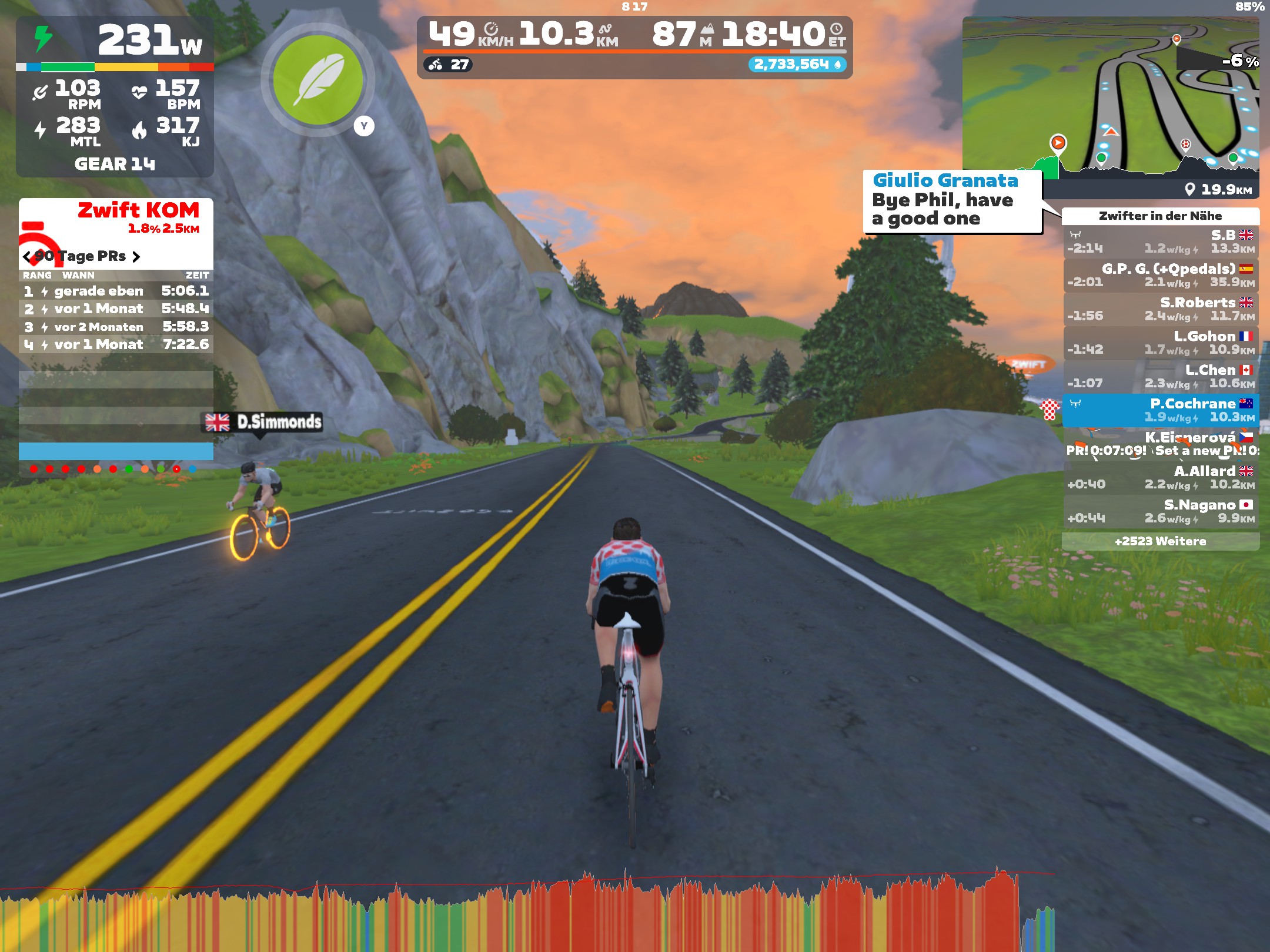
Just in case you’re wondering how the altitude can go negative,11 part of the route goes through “underwater tunnels”. This highlights the flexibility of the virtual worlds within Zwift: the designers have enormous room to let their imaginations run wild. There are all kinds of fun things to discover along the various routes and many that don’t exist in the Real World™. Along with the underwater tunnels (where it’s like riding through a giant aquarium, with sunken shipwrecks, fish, and whales), there is a wild west style town complete with a steam train from that era chugging past. There are also Mayan ruins with llamas (or maybe alpacas?) wandering around and even a section with dinosaurs grazing at the side of the road.
Here’s what it looks like riding through an underwater tunnel:
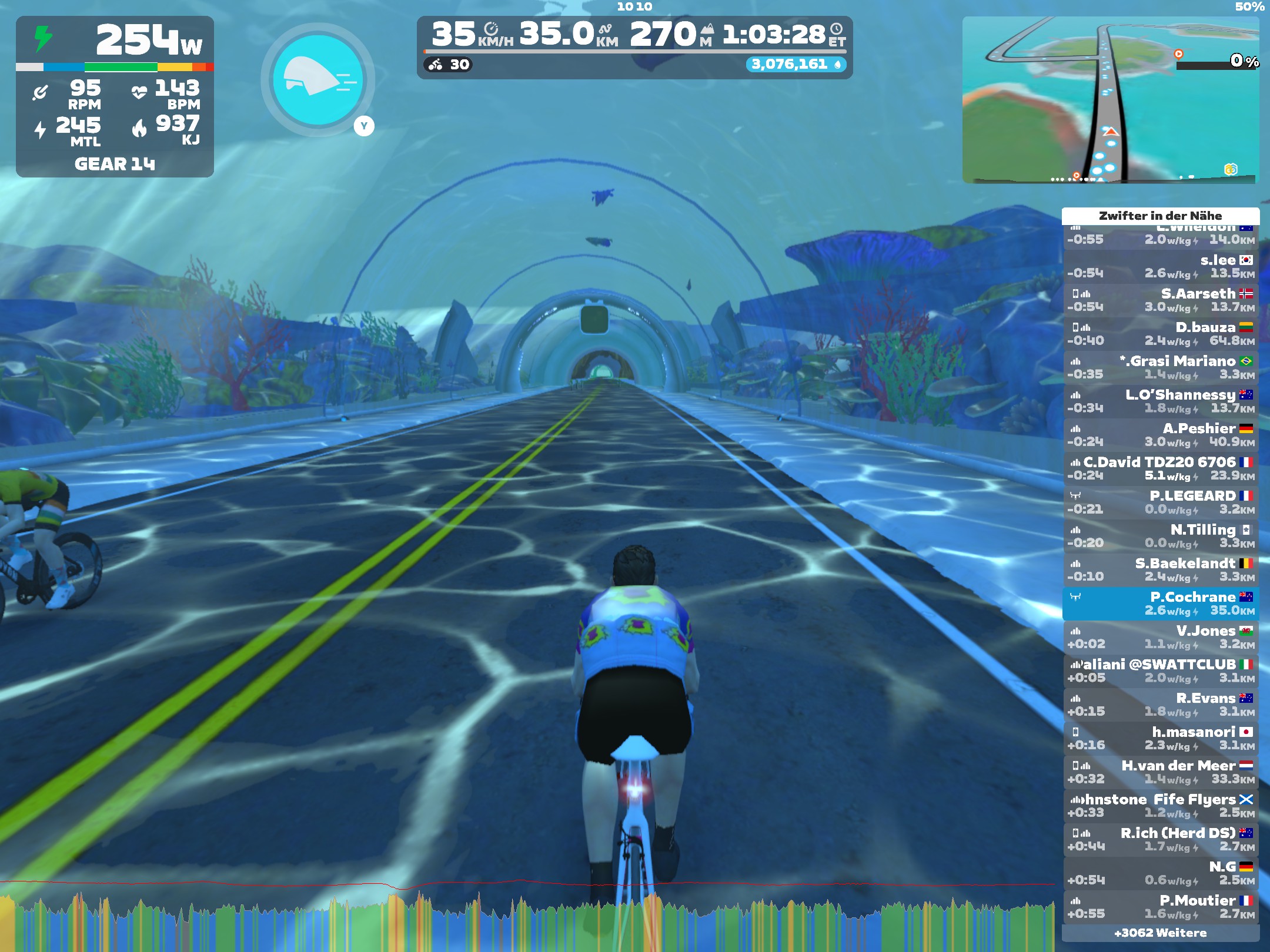
I think that’s pretty cool.
At the end of the ride (at ~53 minutes) my pulse dropped sharply. Since this was the warm-down phase of the ride, this also makes sense.
Power to the people!
There are two peaks in the heart rate data that don’t correlate with altitude (one at ~25 minutes and another at ~48 minutes). The altitude change at these locations would suggest that things are fairly flat. What’s going on there?
One other parameter that we could consider for correlations is power output. Going uphill requires more power than riding on the flat, so we’d expect to see higher power values (and therefore higher heart rates) when climbing. If flat roads require less power, what’s causing the peaks in the pulse? Maybe there’s another puzzle hiding in the data.
Let’s combine the heart rate data with power output and see what other relationships we can discover. To do this we need to extract power output data instead of altitude data. Then we need to change the secondary y-axis data set and configuration to produce a nice plot of power output. Making these changes gives this code:
 1sub plot_activity_data {
 2    my @activity_data = @_;
 3
 4    # extract data to plot from full activity data
 5    my @heart_rates = num_parts('heart_rate', @activity_data);
 6    my @timestamps = map { $_->{'timestamp'} } @activity_data;
 7    my @powers = num_parts('power', @activity_data);
 8
 9    # parse timestamp data
10    my $date_parser = DateTime::Format::Strptime->new(
11        pattern => "%Y-%m-%dT%H:%M:%SZ",
12        time_zone => 'UTC',
13    );
14
15    # get the epoch time for the first point in the time data
16    my $first_epoch_time = $date_parser->parse_datetime($timestamps[0])->epoch;
17
18    # convert timestamp data to elapsed minutes from start of activity
19    my @times = map {
20        my $dt = $date_parser->parse_datetime($_);
21        my $epoch_time = $dt->epoch;
22        my $elapsed_time = ($epoch_time - $first_epoch_time)/60;
23        $elapsed_time;
24    } @timestamps;
25
26    # determine date from timestamp data
27    my $dt = $date_parser->parse_datetime($timestamps[0]);
28    my $date = $dt->strftime("%Y-%m-%d");
29
30    # plot data
31    my $chart = Chart::Gnuplot->new(
32        output => "watopia-figure-8-heart-rate-and-power.png",
33        title  => "Figure 8 in Watopia on $date: heart rate and power over time",
34        xlabel => "Elapsed time (min)",
35        ylabel => "Heart rate (bpm)",
36        terminal => "png size 1024, 768",
37        xtics => {
38            incr => 5,
39        },
40        ytics => {
41            mirror => "off",
42        },
43        y2label => 'Power (W)',
44        y2range => [0, 1100],
45        y2tics => {
46            incr => 100,
47        },
48    );
49
50    my $heart_rate_ds = Chart::Gnuplot::DataSet->new(
51        xdata => \@times,
52        ydata => \@heart_rates,
53        style => "lines",
54    );
55
56    my $power_ds = Chart::Gnuplot::DataSet->new(
57        xdata => \@times,
58        ydata => \@powers,
59        style => "lines",
60        axes => "x1y2",
61    );
62
63    $chart->plot2d($power_ds, $heart_rate_ds);
64}
On line 7, I swapped out the altitude data extraction code with power output. Then, I updated the output filename (line 32) and plot title (line 33) to highlight that we’re now plotting heart rate and power data.
The mirror option to the ytics setting (lines 40-42) isn’t an obvious
change. Its purpose is to stop the ticks from the primary y-axis from being
mirrored to the secondary y-axis (on the right-hand side). We want to stop
these mirrored ticks from appearing because they’ll clash with the secondary
y-axis tick marks. The reason we didn’t need this before is that all the
y-axis ticks happened to line up and the issue wasn’t obvious until now.
I’ve updated the secondary axis label setting to mention power (line 43).
Also, I’ve set the range to match the data we’re plotting (line 44) and to
space out the data nicely via the incr option to the y2tics setting
(lines 45-47). It seemed more appropriate to use lines to plot power output
as opposed to the bars we used for the altitude data, hence the change to
the style option on line 59.
As we did when plotting altitude, we pass the power data set ($power_ds)
to the plot2d() call before $heart_rate_ds (line 63).
Running the script again
$ perl geo-fit-plot-data.pl
produces this plot:
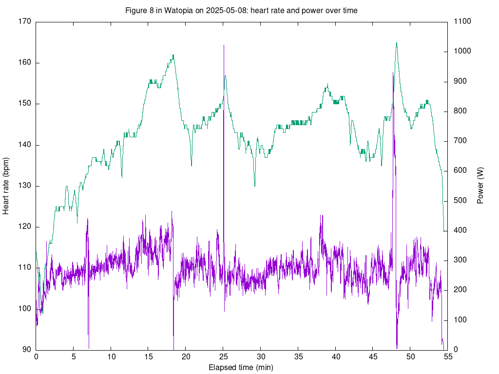
This plot shows the correlation between heart rate and power output that we expected for the first hill climb. The power output increases steadily from the 3-minute mark up to about the 18-minute mark. After that, it dropped suddenly once I’d reached the top of the climb. This makes sense: I’d just done a personal best up that climb and needed a bit of respite!
However, now we can see clearly what caused the spikes in heart rate at 25 minutes and 48 minutes: there are two large spikes in power output. The first spike maxes out at 1023 W;12 what value the other peak has, it’s hard to tell. We’ll try to work out what that value is later. These spikes in power result from sprints. In Zwift, not only can one try to go up hills as fast as possible, but flatter sections have sprints where one also tries to go as fast as possible, albeit for shorter distances (say 200m or 500m).
Great! We’ve worked out another puzzle in the data!
A quick comparison
Zwift produces what they call timelines of a given ride, which is much the same as what we’ve been plotting here. For instance, for the FIT file we’ve been looking at, this is the timeline graph:
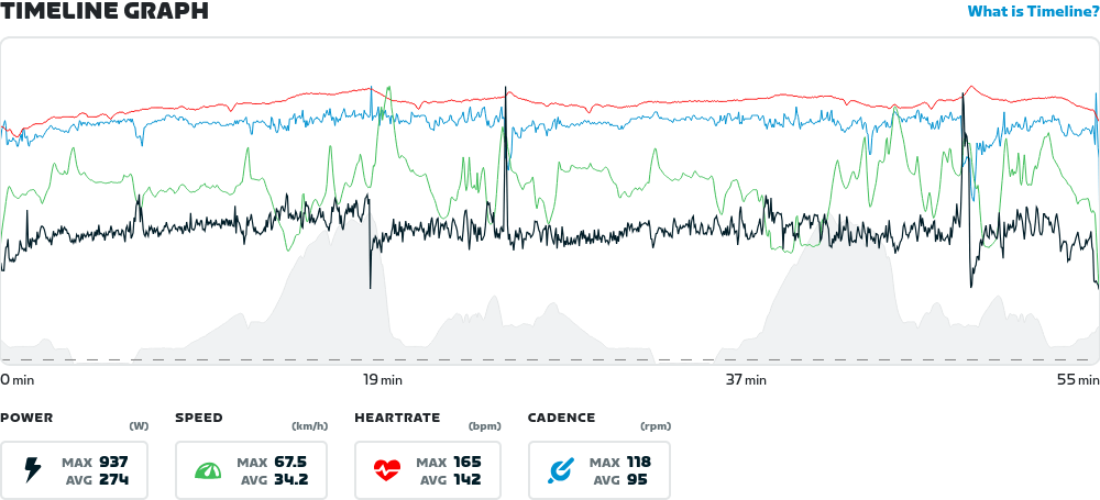
Zwift plots several datasets on this graph that have very different value ranges. The plot above shows power output, cadence, heart rate, and altitude data all on one graph! A lot is going on here and because of the different data values and ranges, Zwift doesn’t display values on the y-axes. Their solution is to show all four values at a given time point when the user hovers their mouse over the graph. This solution only works within a web browser and needs lots of JavaScript to work, hence this is something I like to avoid. That (and familiarity) is largely the reason why I prefer PNG output for my graphs.
If you take a close look at the timeline graph, you’ll notice that the maximum power is given as 937 W and not 1023 W, which we worked out from the FIT file data. I don’t know what’s going on here, as the same graph in the Zwift Companion App shows the 1023 W that we got. The graph above is a screenshot from the web application in a browser on my laptop and, at least theoretically, it’s supposed to display the same data. I’ve noticed a few inconsistencies between the web browser view and that from the Zwift Companion App, so maybe this discrepancy is one bug that still needs shaking out.
A dialogue with data
Y’know what’d also be cool beyond plotting this data? Playing around with it interactively.
That’s also possible with Perl, but it’s another story.
-
I’ve been using Gnuplot since the late 90’s. Back then, it was the only freely available plotting software which handled time data well. ↩︎
-
By default, Gnuplot will generate Postscript output. ↩︎
-
One can interpret the word “terminal” as a kind of “screen” or “canvas” that the plotting library draws its output on. ↩︎
-
I’ve later found out that they haven’t heard anything, so that’s good! ↩︎
-
I live in Germany, so this is the relevant time zone for me. ↩︎
-
All dates are the same and displaying them would be redundant, hence we omit the date information. ↩︎
-
All elements in the array have the same date, so using the first one does the job. ↩︎
-
KOM stands for “king of the mountains”. ↩︎
-
Yes, I am stoked that I managed to take that jersey! Even if it was only for a short time. ↩︎
-
A live result that makes it onto a leaderboard is valid only for one hour. ↩︎
-
Around the 5-minute mark and again shortly before the 35-minute mark. ↩︎
-
One thing that this value implies is that I could power a small bar heater for one second. But not for very much longer! ↩︎
Tags
Feedback
Something wrong with this article? Help us out by opening an issue or pull request on GitHub

