

Document Modeling with Bricolage
Previous Perl.com articles have reviewed where Bricolage fits into the universe of content management systems and worked through Bricolage installation and Bricolage configuration. Now it’s time to go through the steps required to model the structure of an existing web page in Bricolage. Part of the motivation for the redesign of the Bricolage website last summer was to create good examples of document types and templates for use in Bricolage itself. You can take advantage of that work by analyzing a page on the current Bricolage site to determine how to break it down into its basic elements.
First, here’s a brief introduction to document types in Bricolage.
The Elements of Bricolage Stories
Bricolage features two types of documents: stories and media. Stories contain text content and metadata; media are just like stories, but can have a single media file associated with them (an image file, movie, sound file, PDF, etc.). Whether a document is a story document or a media document, elements define its structure.
Elements are the basic building blocks of all documents in Bricolage. There are two types of elements: container elements and field elements. Container elements can contain any number of fields and other container elements. Fields, on the other hand, contain text content. Bricolage presents fields as standard HTML fields such as text, textarea, pulldown, radio, etc.–even a date and time widget. In a document model, one container element is the top element and it, along with all of the fields and subelements it contains, constitutes the structural model for the content of documents based on it.
The important point here is that Bricolage encourages a highly structured model for your documents; documents based on the models are thus structurally consistent. It also makes it easy to write incredibly flexible templates to output content in a variety of formats. (The next article in this series will cover Bricolage templating.) Document models can also be deeply hierarchical, to whatever extent is necessary to accurately model the structure of the documents being managed. Be careful, though, because if the model has too many levels of hierarchy, it will be more difficult for users to conceptualize when editing documents, as well as more work to drill down into deeply nested elements in the Bricolage user interface.
Document Analysis
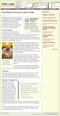 *Figure 1. A screenshot of the article being analyzed*
Document analysis is the process of analyzing the layout of a document and breaking it down into its basic elements. Examining a page on a website, you must determine how all of the basic parts fit together and in what hierarchy, so that you can model the element structure necessary to accurately represent the document in Bricolage. That is, determine the container elements and fields that would be necessary to accurately recreate the document in Bricolage.
For the sake of this article, consider the structure of a typical page on the Bricolage website, because it makes a nice representative sample of the elements articles on the site will likely need (see Figure 1).
Identifying Content
The first thing to do is to determine what part of that page constitutes content and what does not. The term “content” here distinguishes those parts of the page that are important to the document itself, as opposed to the site overall or to a section of the site. For example, the banner at the top of the page appears on every page on the site; it is not specific to this document, nor is it significant to the document’s contents. Likewise, the footer section is global to the site and contributes nothing to the document. The Recent News list in the right-hand column also has nothing to do with the contents of the article, it being a simple list of the five most recent articles published on the entire site.
These other components are includes, because they’re included on many pages–or even on every page of the site. It also doesn’t hurt that web servers generally pull them into the layout via a server-side include technology (such as mod_include, HTML::Mason, PHP, or JSP). Because they’re not significant to the content of the document, you can ignore them for the rest of this analysis. Figure 2 depicts everything that remains.
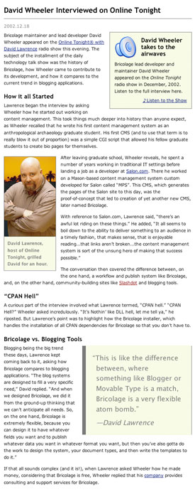 *Figure 2. The important part of the document for the purposes of analysis: the actual content*
Defining the Top Element
Having isolated the content of the page, you can start breaking its content down into its component parts. First, give the document type a name; this name will also be the name of the top-level element. Because this is an article in the Bricolage website, this is simple: it’s Article.
With that out of the way, it’s time to pick out the field subelements of the document element. As fields are meaningful blocks of text, this is generally simple to do: they’re headlines, paragraphs, subheads, and the like. Figure 2 indeed shows meaningful blocks of text:
Headline This is the title of the article. In this case, it’s “David Wheeler Interviewed on Online Tonight.”
Dateline This is the date for the article, here “2002.12.18.”
Paragraph These blocks of text make up the bulk of the content of the article. The first paragraph starts with “Bricolage maintainer and lead developer David Wheeler appeared on the Online Tonight with David Lawrence radio show.”
Header Section headers break up the content into sections, such as “How it All Started” and “Bricolage vs. Blogging Tools.”
Identifying Subelements
 *Figure 3. The components making up a "Related Image" element*
Pretty simple, right? Well the interesting part comes when you identify the container subelements of the layout. The way to do so is to look for areas where content has been logically grouped together as a unit; for instance, to combine an image and its caption. Such is exactly the case with the picture of David Lawrence. Call this container element a “Related Image,” because it creates a link to an image document that’s related to the current article content. Figure 3 illustrates the breakdown of the newly identified element: It has a link to a related media document and it has an “Alt Text” field and a “Caption” field.
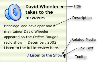 *Figure 4. The pieces of the "Related Audio" element include a tooltip (not shown)*
Another clearly grouped collection of content is the box entitled “David Wheeler Takes to the Airwaves.” This one has a link to an audio document and a description of its contents. It also has a speaker icon, but this isn’t really content; it’s more a hint to the viewer as to what she’s linking to. That is, it’s not content, but presentation. It adds no semantic meaning to the article. To parallel the “Related Image” subelement, call this one “Related Audio.” Figure 4 highlights its subelements.
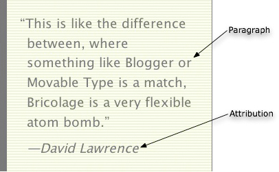 *Figure 5. The "Pull Quote" element has a Paragraph field and an attribution field*
Finally, there’s one last subelement, the “Pull Quote.” It simply groups together a quotation paragraph and an attribution. See Figure 5.
A Note on Layout
Ideally, your analysis is now complete, as you’ve successfully identified all of the elements of our Article document type using this layout. There is one more thing to consider, though: the placement of the Related Audio, Related Image, and Pull Quote subelements.
The ideal in content management is to separate content from presentation. You’ve successfully done so here: you’ve identified the parts of an article (paragraphs, pull quotes, headers, etc.) without specifying anything about the layout (colors, type faces, spacing, placement, etc.). In looking at this example more closely, note that the related audio box is on the right, the related image is on the left, and the pull quote is on the right again. The question is, when a template formats this document for output, how will it determine what goes on the left and what goes on the right?
You might guess that related audio always goes on the right, related images always on the left, and pull quotes always on the right–but if an article has no related audio or pull quotes and five different related images, the layout would end up looking lopsided. Your editors (those who have the least bit of design sensibility) won’t like that.
Another way to handle it is to come up with an algorithm to place these suckers. You might decide, for example, that between the three boxed subelements (Related Audio, Related Image, and Pull Quote), placement might rotate back and forth between the right and the left, or perhaps one on the right, two on the left, two on the right, etc. Of course, the problem with this approach is that, depending on how algorithmic you need it to be, the algorithm might be tricky to write. Plus, your editors still might not like it, and ask you, “Why can’t I just tell it to put it on the left?”
Why not? The separation of content from presentation is the ideal, yes, but it’s not always practical. Plus, sometimes, you can give people the sort of control they need without unduly sacrificing the separation. In this case, solve the problem simply by adding an extra field to each of the subelements: “Position,” with two possible values, “right” and “left.” Now, when an editor adds a pull quote to a document, she can specify the placement in such a way that the template can easily place it. As for the separation of content from presentation: this information is more metadata about the element than content, and you can ignore it when you need to create purely semantic representations (such as XML).
The upshot is that during a document analysis, you must pay careful attention to the semantically meaningful parts of a document and model the appropriate elements, and then weigh the importance of providing additional, non-semantic presentation metadata fields to give editors the control they need to get their jobs done. Go for the middle road and keep everyone happy.
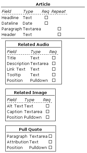 *Table 1. The completed document model. In Bricolage, all subelements are optional, meaning that users can add any number of Related Image, Related Audio, and Pull Quote elements to a document.*
The Document Model
Having performed your document analysis (and of course, in practice, you should examine several different pages on a site to ensure that you don’t miss any elements that are present in some articles but not others), you can now synthesize the breakdown of the elements into a comprehensive model. In practice, that’s pretty simple. See Table 1 for the complete representation. Based on the analysis, you’ve decided on the types of the fields (text, textarea, pulldown, etc.), whether they’re a required part of the element they’re in, and whether they’re repeatable. For example, the headline of the article is required, but not repeatable, because all articles must have a headline but not more than one headline. Paragraphs, on the other hand, are not required, but there can be more than one. You can also say that paragraphs are required and repeatable, in which case at least one would need to be in the element. When doing your own document analysis, take the path that makes the most sense to you.
Container elements, on the other hand, currently have no such occurrence specification. You can add any number of any of the defined subelements to a document, including none. We may add occurrence specification for container elements in a future version of Bricolage.
This example is pretty simple. However, the Article document type for the Bricolage website is quite a bit more complex. See the complete model of the Article document type. In fact, the Bricolage site contains a graphical representation of all of the Bricolage website document models. (I used the special Bricolage introspection template to generate the tables displaying the models.)
Element Administration
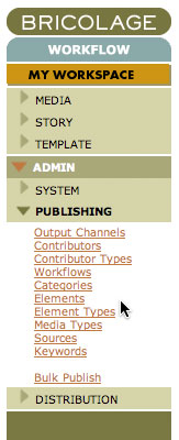 *Figure 6. Navigate to the Element Type Manager and the Element Manager to administer elements*
The next step is to model, in Bricolage, the elements you’ve discovered. There are two administrative tools to use to create the elements: The Element Type Manager and the Element Manager. To access these managers, use the Bricolage side menus (see Figure 6) to navigate to ADMIN -> PUBLISHING -> and select the appropriate manager. You will see a search interface to search for and edit element or element-type objects. Clicking the Edit link for an element type, for example, brings up the Element Type Profile, where you can edit the attributes of the element type.
Element Types
Each element in Bricolage has an associated element type that defines a few attributes that its associated element share. There are three different kinds of element types: story element types, which define the structure of story documents; media element types, which define the structure of media documents; and subelement element types, which define the structure of container subelements. See Figure 7 for a snippet of the element type interface. The attributes you can set on element types are:
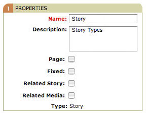 *Figure 7. A segment of an element type profile called "Story"*
Page Indicates whether an element is a page. Sometimes documents need to have multiple pages through which readers can navigate. You may recognize multi-page documents from Perl.com, where you navigate from page to page via Next Page and Previous Page links.
Fixed A fixed document is typically one that does not have the date as a part of its URI. Output channels defined in Bricolage specify two URI formats for the documents published to them. One of those formats is the “fixed URI format.” If a story based on an element has the “Fixed” checkbox checked in its element type, the story uses the “fixed URI format.” Otherwise, it’ll use the non-fixed URI format. (The next article will cover output channels in detail.)
Related Story Elements associated with an element type with the Related Story checkbox checked can have an associated story document. This is useful for creating lists of stories related to the current story, for example.
Related Media The Related Media checkbox is just like the Related Story checkbox, except that it allows the creation of a relationship to a media document rather than to a story document. The Related Image and Related Audio elements depend on this checkbox being checked.
Media Type This applies only to media element types–that is, elements that define the structure of media documents. This attribute is a pulldown list, featuring the options Image, Video, Audio, or Other. Of these options, only Image has any effect; image elements automatically have fields associated with them for height, width, color depth, and a few others. Bricolage automatically populates these fields when you upload an image file.
Given how element types work, the Article document type requires the following element types:
Audio There are some media documents to manage. The first is Audio, required to manage the audio recordings associated with the Related Audio subelement. The Audio element type is a media element type with its media type set to Audio, surprisingly enough.
Image The Image element type sets attributes for image document types. It is just like the Audio element type, except that it has its media type set to Image instead of Audio. Go figure.
Story This defines the shared attributes of story elements, of which the Article element is one. It does not use a fixed URL (so that the article’s cover date shows up in the URI), and has neither a related story nor related media. The Page attribute is irrelevant to this element type.
Subelement This simple element type defines generic subelements. There are no special attributes of these subelements, so don’t check any. The Pull Quote subelement is an example: it’s not a page, and it doesn’t have an associated media document or story document.
Related Media This subelement element type defines elements that have media files associated with them. It has its Related Media checkbox checked, and will be used to define Related Audio and Related Image elements.
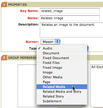 *Figure 8. Creating the Related Image element*
Elements
Now it’s time for the building blocks. You defined several elements in your analysis of the Bricolage.cc page. Now you need to model them in Bricolage, basing each on an element type. When administering elements, you typically first create those farthest down the hierarchy, because you’ll need to have them available to associate when you create those farther up. Start with the Pull Quote, Related Image, and Related Audio elements, and then create the Article story type element.
First create the Related Image element (Figure 8). The Key Name field uniquely identifies the element throughout Bricolage, while the burner determines the kind of templates that will be used to format Related Image elements. Be sure to select the Related Media element type! This is useful for many things, including giving templates the ability to easily get a handle on an element, as well as providing the file name for templates based on this element. It’s generally a good idea to make the key name the same as the element name, but lowercased and with spaces replaced with underscores (uppercase letters and spaces are not allowed in key names).
The Burner pulldown list allows selection of the burner that will be used to format the element. As mentioned in the Bricolage introduction article, Bricolage currently supports three templating systems for formatting content: Mason, Template Toolkit, and HTML::Template (but with PHP support arriving in the forthcoming Bricolage 1.10, due out in September; stay tuned!). The Bricolage objects that push stories through the templates in a particular output channel are burners, ostensibly because they “burn” files to disk (but rumor has it that the name really came about when the original developer of the Mason burner wanted to write a burn_one() method). I’ve selected Mason for this example because all of the Bricolage site templates use Mason.
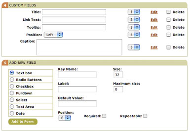 *Figure 9. The fields subelements defined for the Related Image element*
Click the Next button to create the Related Image element. Now you need to add any necessary subelements and fields. Look back at the model in Table 1: the Related Image element has no subelements, but it does have a few fields. Figure 9 pulls out the relevant part of the element profile. (Click an Edit link to edit an individual field element definition, or use the Add New Field section to add new fields to the element.) Note that you’ve already added the necessary fields. Should you decide that they should display in a different order, simply change the values of the numbered fields (changing one will cause the others to renumber automatically). You can also edit or delete each one to change its values.
The Add New Field section allows you to define new fields for the element, selecting from several available types (text, textarea, pulldown, date, etc.) and filling in the appropriate fields. Each option features different fields to fill in, but the important ones are:
Key Name This field uniquely identifies the field among all the fields in the container element. While no field in a single element can have the same key name, a field in one element can have the same key name as a field in another element. Like container element key names, they must be lowercase and have no spaces. Again, I tend to use a key name that is the same as the name except for those two rules.
Label This is the name of the field. A field can have the same name as another field, but that would be silly, now wouldn’t it?
Default Value The default value for a field when adding a new one to an element. For example, a URL field might have a default value of “http://” as a sort of reminder to editors as to what belongs in the field. It might also make sense to use the most common value for the default (such as with the Position field, where the default is “left”).
Size The size of the field in the display. Text fields use this value to set the width of the field (in characters), while Select fields use it to set the number of values to be displayed in a scrollable select field. The textarea field has Rows and Columns fields, instead, to indicate the size at which to display the field in the interface.
Maximum Size The maximum size of the allowed value. This option limits the length of a text or textarea value to a certain number of letters.
Required Indicates whether, when adding a new element, the field will be included in the element or the editor needs to add by the editor. The “required” moniker is unfortunate in this case, because it does not mean that the field is required to have a value, only that it’s required to be present in the user interface.
Repeatable Indicates whether or not a field is repeatable. For example, a paragraph field would be repeatable, because we want an editor to be able to add more than one paragraph to a story.
Position Indicates the order in which the field appears in the user interface. This value affects only required fields, and causes all required fields to be displayed in the order indicated. This does not prevent an editor from reordering fields, however.
Options This field allows you to specify a range of values for a field. It applies only to Radio Button, Pulldown, and Select fields. Each value goes on a single line, with the option first and then an optional label, separated by a comma.
Allow Multiple This checkbox is specific to the Select field. When checked, users can select more than one value.
You may edit each of these fields, with the exception of the key name, by clicking its Edit link.
Following the model (Table 1), creating the necessary fields for the Related Audio element becomes simple. The Title, Link Text, and Tooltip fields are simple non-repeating text fields; the Description is a non-repeating textarea field; and the Position field is a non-repeating pulldown field. It’s fine to accept the default values for the other fields (size, columns, rows, max size, etc.). For the Position field, however, add two values to the Options field:
left,Left
right,Right
Also set the default value. I’ve opted for “left” (and, indeed, that’s what shows up as the default value for the field in Figure 9), but you could also set it to “right.”
Creating the Related Audio and Pull Quote elements is much the same. The only difference is in the fields included and in the selection of an element type (Related Audio is a Related Media type, like Related Image, but Pull Quote is a Subelement).
Now, the Article element–the element that determines the structure of all articles, and therefore defines the Article document type–is a bit different. Defining its fields is of course the same, but you actually have modeled more fields than you need. You see, all documents in Bricolage have a Title field and a Cover Date. You can use these in place of custom Headline and Dateline fields; therefore, you don’t have to define them. What’s left, Paragraph and Header, define in the same way as fields in all elements.
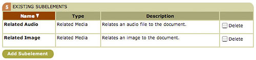 *Figure 10. The subelements of the Article element. Click the Add Subelement button to search for other elements and add them to Article*
Defining subelements is almost the same, although the other elements had no subelements of their own. Figure 10 shows the Existing Subelements section of the element profile. In this example, the Related Audio and Related Image subelements have already been associated with the Article element, but you still need to add the Pull Quote element. Click the Add Subelement button to bring up a page very similar to the element manager: there’s a search box, and you can view the results of your search. Unlike the element manager, however, this interface displays only subelements (that is, those elements that are associated with subelement element types, not story or media element types). Type in and search on the string “pull”, and then when you get the search results, select the Add to Element checkbox, and click the Add Elements button. Figure 11 illustrates this process.
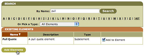 *Figure 11. Use the search field to find the element you want, check the "Add to Element" checkbox, and click the Add Elements button.*
Now the Article document type is complete! Well, almost. I’ve left out that there are other fields to fill in for story type and media type elements: sites and output channels. Because Bricolage is designed to manage multiple sites, each story or media type element must be associated with one or more sites. Each site associated with the element can create documents based on the element. By default, Bricolage has only one Site, Default, so you can just leave it associated with the Article element (if your installation has only one site, then that one site will be associated with all new story and media type elements).
As for output channels, each site has a primary output channel associated with the element. You can add extra output channels as needed. Bricolage has a single output channel by default, called Web, and you can leave this as the selected value. Again, the next article will cover output channels in more depth.
Now the Article document type is complete, and you’re ready to start creating documents based on it.
Categories
There is one final topic to discuss before you can create a story document based on the Article document type: categories. Categories are hierarchically organized content locations. Think of them as similar to a file system of directories (or folders, for you Mac fans out there). Indeed, categories in Bricolage are used in the URIs of story and media documents, so the translation is close (modulo date parts and slugs). They are also used to categorize content, so it makes sense to create category hierarchies that make sense for your site.
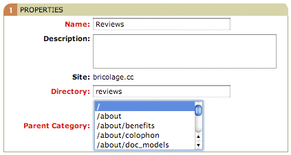 *Figure 12. Create new categories starting with top-level categories added as subcategories to the root category, "/"*
For example, if your site were a newspaper featuring movie and book reviews, you might want to create a category named Reviews as a subcategory of the root category ("/"), and then subcategories of the Reviews category named Books and Movies. The full URIs for these categories would be /reviews, /reviews/books, and /reviews/movies, respectively.
To create categories for your site, navigate to the Categories manager under ADMIN -> PUBLISHING and click “Add a New Category” for each category you wish to add. The root category already exists for each site, so start by creating your top-level categories and make your way down. See Figure 12 for an example creating a top-level Reviews category.
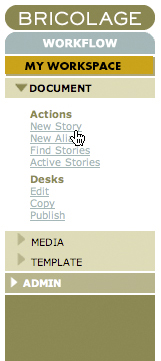 *Figure 13. Navigate to the Story workflow and click New Story to create and edit a new story*
Document Editing
Having created the categories you need, you can create a story document based on the Article story type. Open the Story workflow in the side navigation and select New Story (Figure 13) to bring up the New Story screen shown in Figure 14. Enter a title and slug. A slug is a very short hint (one or two words, separated by an underscore or dash) as to the contents of the story. Generally, the slug should complement the category selection rather than repeat it. For example, if you were creating a review of The Princess Bride in your /reviews/books category, you might make the slug “princess_bride.” Select the Article story type, and cover date and click the Create button. This action creates a new story in the Story workflow and puts it on that workflow’s “start desk,” in this case the Edit desk.
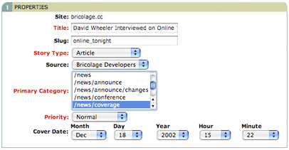 *Figure 14. Create a new story based on the Article story type. Be sure to enter a meaningful slug and cover date, and put the article in the relevant category*
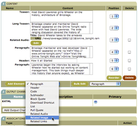 *Figure 15. Add fields and elements to the story in the Content section of the story profile*
The new story will then open in the story profile. The first section of the profile, Properties, mostly covers the same data points as the New Story screen. It’s the second section, Content, that is most interesting (Figure 15). The bottom of this section has an Add Element button and a select list. From this list, you can select the fields or container subelements you’d like to add to the story. After adding a field, you can edit it, as with the Teaser and Long Teaser fields in Figure 15.
Notice that the names of the elements available in the Add Element select list is identical to the names of the container elements and fields associated with your modeled Article story type element. Because these are the only content containers that editors can add to a story, the structural integrity of the story strictly adheres to the model you created. The advantage is that the structure of the stories to be published to the site will be consistent across stories. This approach enables the maintenance of document standards and styles across a site, which can be very important in a large organization with thousands of pages of content to maintain. It also allows for simple yet extremely flexible templating, so that you can output documents in a variety of formats (XHTML, RSS, PDF, etc.) while maintaining identity and design standards.
Why are container elements and fields all listed together in one select list? Because as an editor works on a story, she doesn’t need to think in great detail about what to add. It’s unnatural for a writer to have to stop and think, “Do I want to add a container element or a field?” as she decides from which list to select. She only has to think, “I need to add a paragraph” or “I think a pull quote would work well here.” The difference is important to us a document modelers and, later, as template developers, but for editors, the distinction is irrelevant.
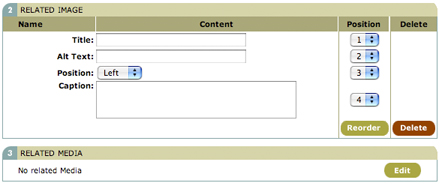 *Figure 16. Edit the fields of the Related Image subelement. Click the Edit button in the Related Media section to search for an image document to relate to this element*
If you elect to add a subelement, say by selecting the Related Image option, you will then see the profile for that element. Figure 16 illustrates the Related Image element profile. Note how the required fields for this element (Title, Alt Text, Position, and Caption) are in the profile. Furthermore, because this is a related media element, there’s an extra section called, curiously enough, Related Media. By clicking the Edit button, you can search your existing media documents to create a relationship, much as you searched for subelements to add to an element in the element manager. In Bricolage 1.10.0, you can also upload a media file directly in this interface, implicitly creating a media document in the same category and with the same cover date as the current story.
Click the Save button to save the element. Back in the main story profile, the new Related Image subelement will appear in the Content Section. You can re-order elements and fields by selecting new values from the Position select lists adjacent to each element. To edit a field, simply do so directly. To edit the Related Media subelement again, click its Edit button and you’ll return to its profile.
Before finishing with this story, there’s one more editing interface that’s important to know. Adding individual fields to a story so as to keep their contents in independent records is all well and good, but the first time you tell an editor that she has to add each paragraph one at a time, duck. Just as an editor doesn’t want to think about whether to add a container element or field to a story, she also doesn’t want to have to go to a select list, click a button, and wait for a browser reload every time she wants to add a single paragraph.
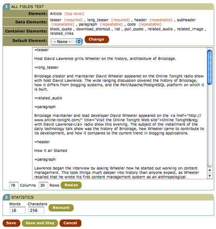 *Figure 17. Super Bulk Edit allows editors to use POD-like syntax to edit all of the fields in an element in a single textarea box*
For this reason, Bricolage features two other interfaces for editing. The first, Bulk Edit, allows editors to edit all instances of a repeatable field in a single textarea. This is convenient if the majority of the content of a story is paragraphs, for example. The editor can simply write all the paragraphs she wants in a textarea box, separating each with a blank line. To use it, simply select the type of repeatable field to edit and click the Bulk Edit button to the right of the Add Element button and list.
Most documents are not simple lists of paragraphs though (if they were, you wouldn’t need a tool as sophisticated as Bricolage). Instead, they’re a mix of different blocks of content; the so-called Super Bulk Edit feature will likely prove to be more useful. To use it, select Super Bulk Edit from the Bulk Edit select list and then click the Bulk Edit button. Doing so will bring up the screen depicted in Figure 17. Here, you can edit all of the fields and subelements of the current element in a single textarea field. Each individual field or subelement has POD-like tags that start with an equal sign (=) and end with the key name of the element or field. The tags for subelements each exist on a line by themselves, while field tags identify the field to which the contents below them belong. You can even select a default element (say, Paragraph) from the Default Element select list, and then any blocks of text that have no POD tag will default to that element. This approach makes it easy for writers to edit all the different parts of an element without having to select, reload, and wait for every one. They can also create and reorder subelements, although they cannot change the contents of subelements themselves.
Click Save to return to the story profile, and the Save button there to save the story and return to My Workspace. Now you have created a story based on the article model. Go ahead, create as many more as you like.
Up Next: Templating
The next article will show how to write your first templates in Bricolage to format stories for output, so that you can actually see how your documents will look when they’re published. Stay tuned!
Tags
Feedback
Something wrong with this article? Help us out by opening an issue or pull request on GitHub

